Challenge: Infusing American Heritage into Visual Identity
Revere Ink, a distinguished printing company deeply entrenched in American soil, embarked on a journey to reshape its brand identity to reflect its profound connection with American heritage. The challenge was to encapsulate the essence of the nation's spirit, values, and innovation within a modern and versatile visual identity.
Solution: The Essence of Americana Reimagined
Our approach was a fusion of history and creativity, aiming to breathe new life into Revere Ink's brand identity while paying homage to its American roots. We sought to encapsulate the spirit of Americana—freedom, diversity, and progress—within a contemporary design language that resonated with a broad audience.
Implementation: Redesigning with Stars and Stripes
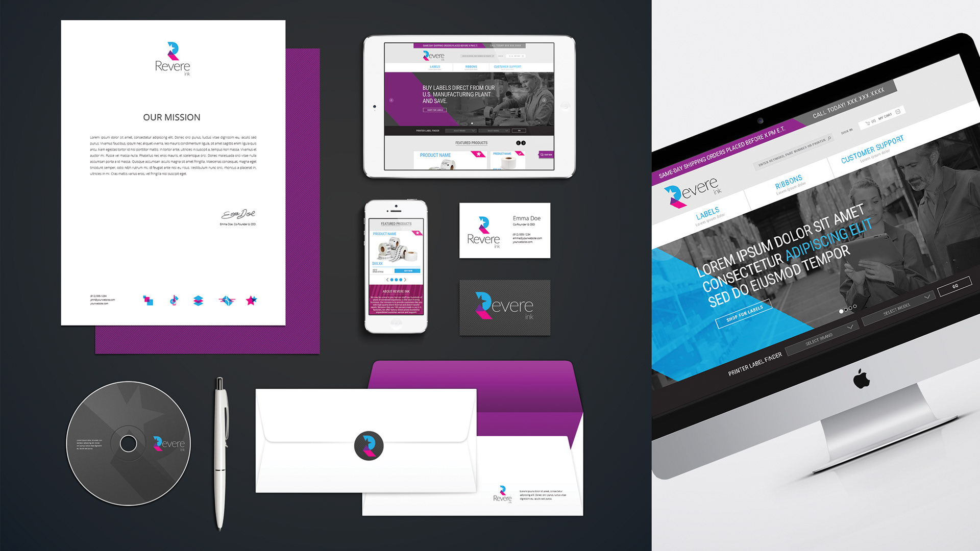
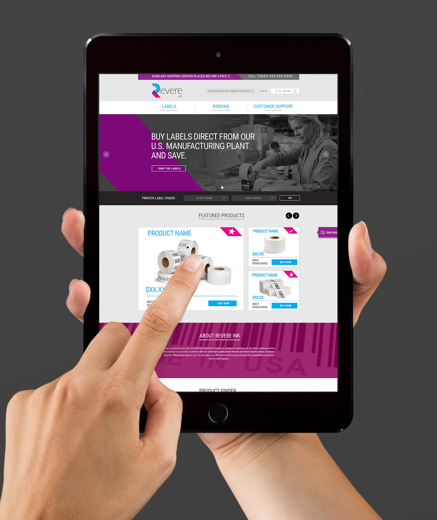
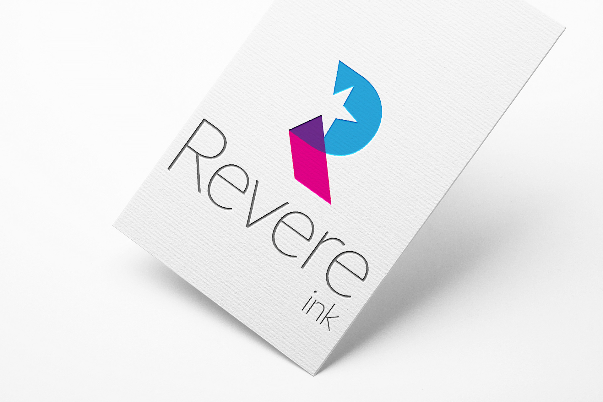
Collaborating closely with Revere Ink, we embarked on the journey to redefine their visual identity. Drawing inspiration from iconic American symbols like the stars and stripes, we distilled the essence of the American flag into a dynamic and versatile logo. The color palette paid homage to the nation's landscapes, while typography echoed the balance of tradition and modernity.
Every touchpoint, from business cards to signage, was meticulously designed to reflect Revere Ink's American lineage. The redesigned identity was a tribute to the nation's heritage, while propelling the brand into a new era of growth and recognition.
Results: Breathing Life into an Iconic Identity
The transformation was more than skin-deep. Revere Ink's reimagined identity became a testament to the enduring spirit of American entrepreneurship. The new brand image resonated with clients and partners alike, symbolizing the company's dedication to quality, innovation, and the values that define the American Dream.
Revere Ink's renewed identity transcended design; it became a powerful narrative that spoke of legacy, progress, and the enduring pursuit of excellence. The redesigned visual identity not only aligned with its American heritage but also positioned Revere Ink as a torchbearer of American craftsmanship in the modern age.
A Brand Identity Rooted in American Heritage
The journey of Revere Ink's brand identity redesign showcases how a printing company can encapsulate the ethos of a nation within its visual narrative. By drawing inspiration from American symbols, values, and innovation, Revere Ink's identity became an embodiment of heritage and progress. This case study underscores the brand's role in preserving and celebrating American values while staying poised at the forefront of design and printing excellence.
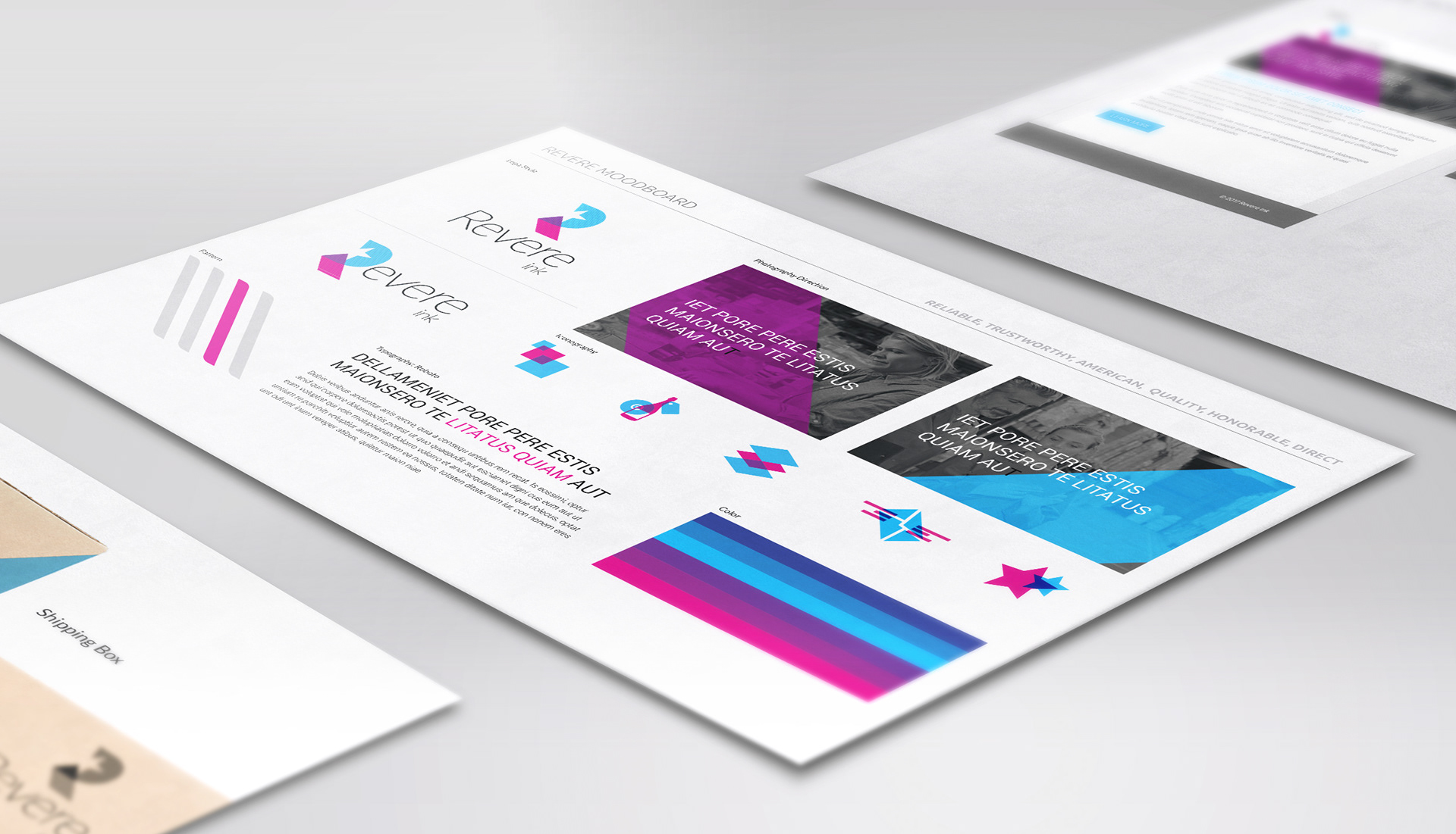
Moodboard
logo